
I’m not sure if people care all that much, but whenever I visit this community I can’t help but notice the fairly ugly icon and banner which is clearly AI generated.
Would it be worth updating these? Heck I can make something for the community if needed
You must log in or register to comment.
I agree 100%, both look super ugly
As an alternative, there are tons of gamepad icons on freepik like this one that could be used as long as theres an attribution link in the community description.
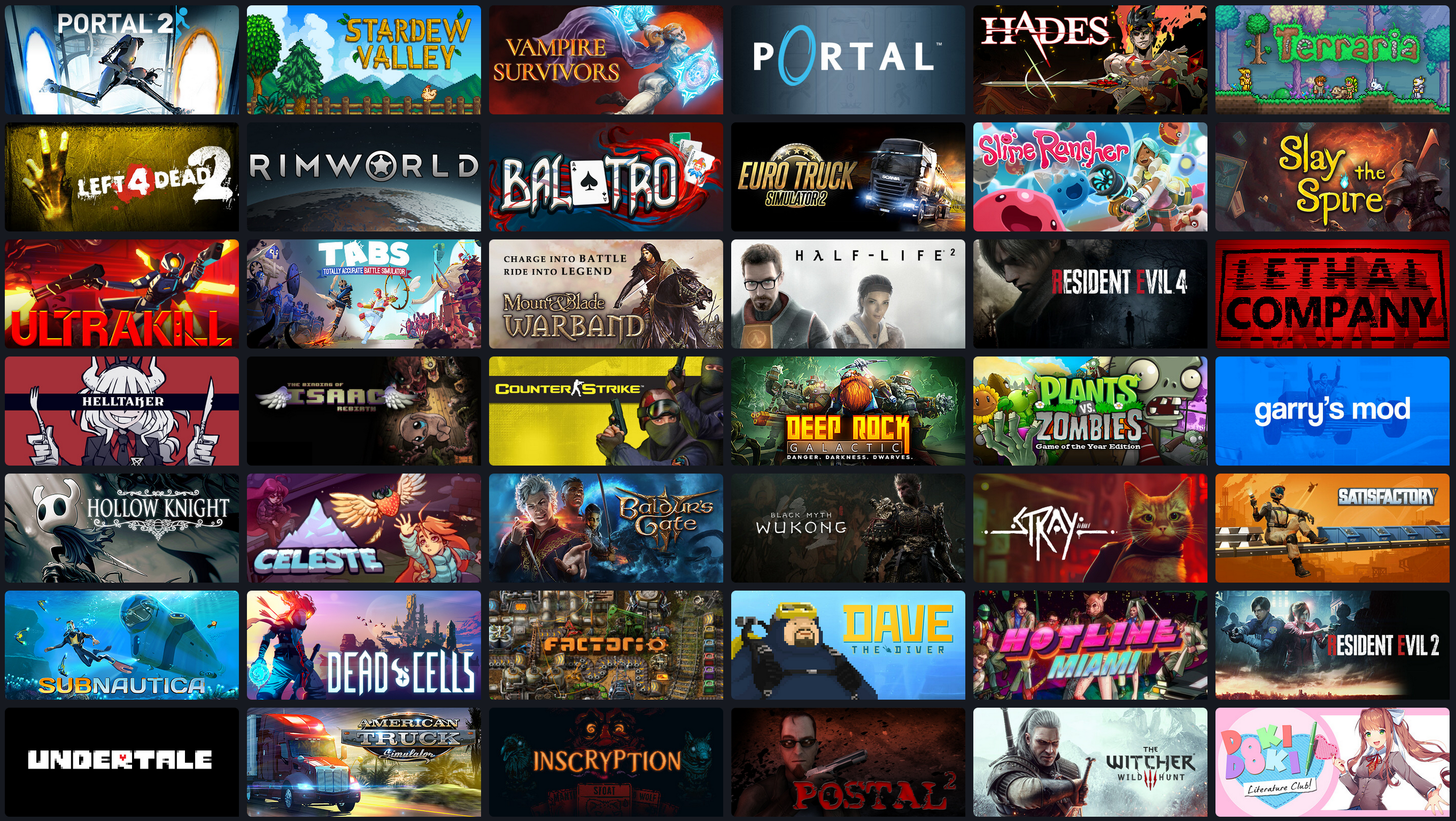
Also here’s a quick collage I screenshotted from steamdb, feel free to use it if there aren’t any better ones by others:
The app I use to browse Lemmy doesn’t show banners so I never noticed but once I pulled it up in browser I agree 100%. That’s a really bad banner.
I’ve never looked that close, but now that I have I’m on your side.
Second that. AI these days: as if nobody here could create a screenshot from its steam library: like [email protected] already did. I bet prompting AI even took longer to create that shitty version of a steam library.