- 4 Posts
- 3 Comments
Joined 2 years ago
Cake day: September 3rd, 2023
You are not logged in. If you use a Fediverse account that is able to follow users, you can follow this user.


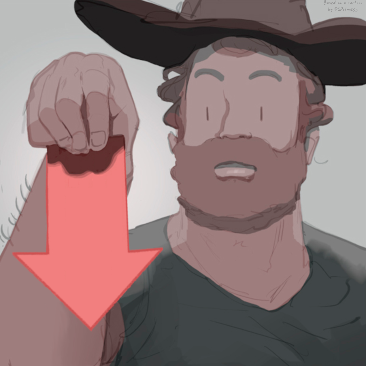
Thanks, that’s good advice. How about this one?

Colors aren’t final tho
I like the recommendations, but I think the logo should be less generic. I threw this together quite quickly, just wanted to get the idea out there:

Any feedback? It does look a bit off currently


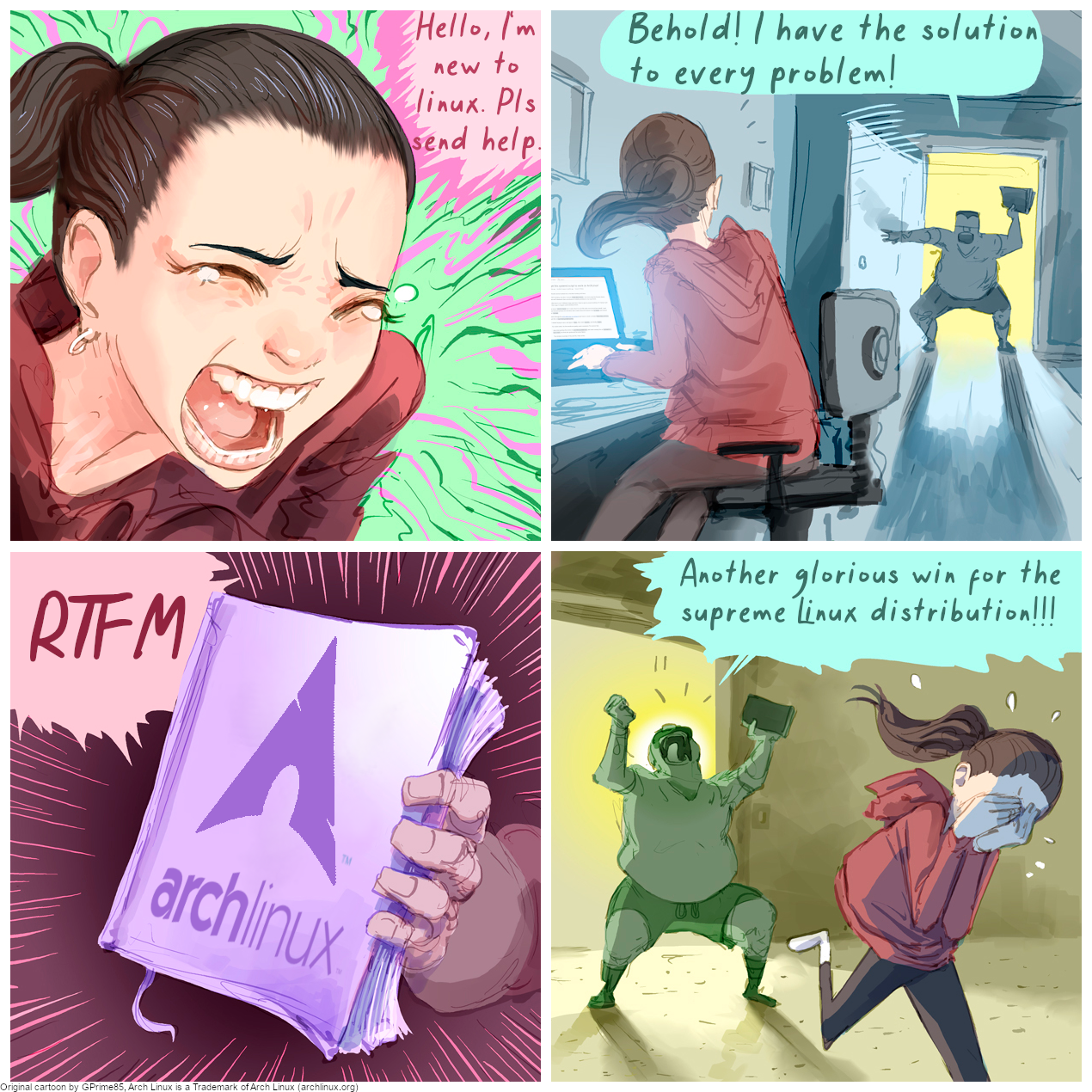
Dayummmmmm! This is fire! Looks like you really know what you’re doing. Glad you liked the idea.
Edit: Did you recreate this from scratch?